Apple’s latest update in the iOS 26 Developer Beta 3 has quietly, yet shockingly, walked back its most hyped design experiment — Liquid Glass. The once transparent, ultra-glassy UI now wears a frosted veil. But is this a retreat or refinement?
Let’s dive into everything that’s going on behind Apple’s sudden frosty pivot and what it means for iPhone users, developers, and tech fans alike.
What is Liquid Glass?
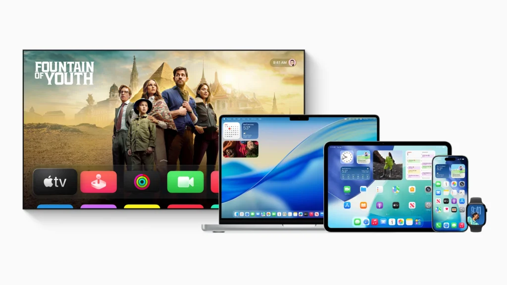
Liquid Glass is Apple’s new design language, first introduced at WWDC 2025. Inspired by the reflective, refractive, and translucent nature of real-world glass, it made menus, control centers, and navigation bars almost completely transparent, giving iOS a futuristic and layered feel.

It wasn’t just eye candy. Apple pitched it as a blend of form and function. But then… reality hit.
Why Apple Introduced It in iOS 26
Apple’s design team wanted something bold — a UI that felt alive and immersive. Liquid Glass was supposed to reinvent how users interact with their phones. You’d feel like you’re peeking through layers of apps and content.
However, the transparency-heavy visuals looked good in demos but faced real-world usability challenges.
Recap: The Liquid Glass Dream at WWDC 2025
When iOS 26 was revealed at WWDC, Liquid Glass stole the show. It was a clean, bold shift. Developers and fans were wowed. Apple’s demos showed navigation bars blending into the background, and control centers floating like crystal panels.
But by the time Beta 1 rolled out, excitement turned into confusion for many users.
What Changed in iOS 26 Developer Beta 3?
With Beta 3, Apple pulled a quiet design reversal. The overly glassy, see-through UI is now more… frosted. Think blurred opacity instead of clear transparency. It’s a small change on the surface, but it changes the feel of the entire system.
Areas Affected:
- Control Center: No longer ultra-transparent. Widgets now sit on a lightly frosted background.
- Search Bars & Notifications: Text boxes now have more contrast, improving readability.
- Apple Music: The navigation bar lost its shimmer. It’s now solid white, focusing on clarity.
Why Did Apple Tone It Down?
Apple didn’t just wake up and change it for fun. Here’s why this pivot happened:
- Public Backlash
Users complained on social media about legibility issues. Icons and text would blend into the background, especially in bright or complex wallpapers.
- Performance Issues
All that real-time background rendering? It was chewing through RAM and draining batteries, especially on older models.
- Accessibility Concerns
For users with vision impairments or sensitivity to transparency effects, Liquid Glass created more problems than solutions.
Transparency vs Frosted: A Design Shift
In Beta 2, Liquid Glass looked cool. But cool doesn’t always mean usable. Beta 3 tones it down by adding a soft blur. It’s less flashy and more functional.
Visual Comparison:
- Beta 2: Clear like crystal — but hard to read.
- Beta 3: Matte and frosted — easier on the eyes.
What the Tech Community Is Saying
Tech influencers have opinions, and they don’t hold back.
But not everyone’s upset. Many praised Apple for listening to feedback.
Is Apple Backtracking on Its Vision?
Maybe. Or maybe they’re just testing the waters. Apple’s beta program exists for this reason — to test, break, and fix things before release. What you see today might evolve into something entirely different by September.
How It Impacts You (Yes, You!)
Whether you’re a regular iPhone user or an app developer, this frosted update matters.
- Improved Readability: You won’t squint to read your notifications.
- Better Performance: Devices run smoother, especially on A15 chips or older.
- More Consistent Design: Apps now look unified, not chaotic.
Also Read: Spider-Man: Brand New Day – Full Cast, Plot Twists, Villains & Leaks Revealed
UI Psychology: When Design Becomes a Problem
Design isn’t just about looks. It’s about how we feel while using something.
Transparent UIs often look futuristic but can overwhelm the eye. Our brain prefers contrast and clarity. That’s why Apple is dialing things back — to keep the experience comfortable and accessible.
Apple’s Beta History Shows a Pattern
Apple has walked back bold UI moves before:
- iOS 7: Introduced flat UI, then added contrast due to backlash.
- iOS 11: The messy control center was revamped later.
- iOS 16: Lock screen customizations were buggy at first — then got better.
Liquid Glass might be going through the same learning curve.
What to Expect in the Final iOS 26 Release
Don’t panic — it’s still early. Apple will likely continue tweaking the UI before the official release in September 2025. You may even see a new toggle to switch between transparency levels.
Is the New Frosted Look Better?
Depends on who you ask.
- Design Lovers: Might miss the “wow” of Liquid Glass.
- Everyday Users: Will love the cleaner, more readable interface.
- Older iPhones: Will definitely perform better.
Should You Install Developer Beta 3?
If you’re a developer, yes — you need it to optimize your apps. But for regular users?
Pros:
- Get a sneak peek of iOS 26
- Experience the new frosted UI
- Help Apple improve the system
Cons:
- It’s buggy (like all betas)
- Can affect battery life
- Might break certain apps
Final Thoughts: A Frosty Step in the Right Direction?
Apple’s move to frost over its Liquid Glass UI isn’t just cosmetic. It’s a sign of a company that’s still willing to listen. While some may call it a retreat, others see it as evolution — from flashy to functional.
This isn’t the end of Liquid Glass. It’s just Apple figuring out how to make it work for everyone. And that’s what good design is all about.
FAQs
Q1. What is Liquid Glass in iOS 26?
Liquid Glass is a new Apple design language that introduced transparency and glass-like UI effects in iOS 26.
Q2. Why did Apple reduce the transparency in iOS 26 Beta 3?
Due to user complaints about legibility, accessibility, and performance issues, Apple opted for a frosted look in Beta 3.
Q3. Will the frosted look stay in the final iOS 26 release?
Possibly. Apple often tweaks UI elements based on feedback during beta phases.
Q4. Does the new frosted design affect battery life?
Yes, positively. The toned-down visuals reduce GPU strain, especially on older devices.
Q5. How can I install iOS 26 Developer Beta 3?
You can install it via the Apple Developer Program. However, it’s not recommended for daily use unless you’re a developer or tester.